Testing Visualisation in Pandas on Retail Network Data
Hands-on Visualisation Test on a Kaggle Spreadsheet in Pandas
DATA
Ian Ng
7/13/20253 min read


Time for a Hands-On
Visualization may look easy as drag-and-drop rows and columns on Tableau, but doing it in pandas might be more of a trial-and-error discovery, and constant referrals towards the pandas official documentation.
The Data
From the Kaggle website, the data card states: The sales details of different stores of a supermarket chain that has multiple stores in different parts of the US. There was no dates specified for each of these sales transactions, so we can assume this is from the same period across the country.
The spreadsheet contains: state,city,ship mode, category, region, sales, discount, profit and more. I'll only be using a few to do visualization.
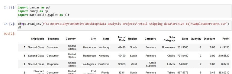
We start by importing the necessary libraries and loading in the data:
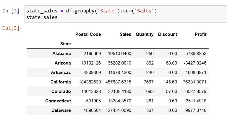
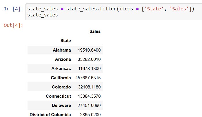
Now, to get the total sales in each State, grouping by is needed and followed by the sum:
To start plotting a simple bar graph, i needed only 2 columns to form the x and y, namely the index State and the value Sales:
or I could have done the filtering with the df[]attribute.
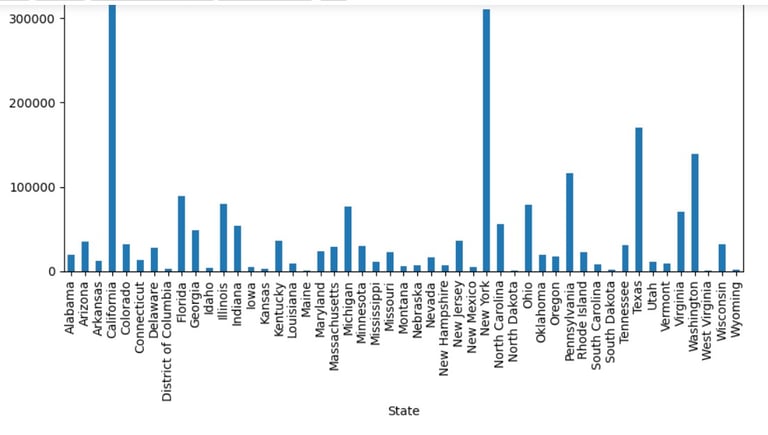
Next, jumping to the plotting. I would want to create a bar graph to see which State has the highest sales through comparison:
state_sales.plot(kind='bar', figsize = (10,6))
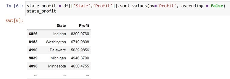
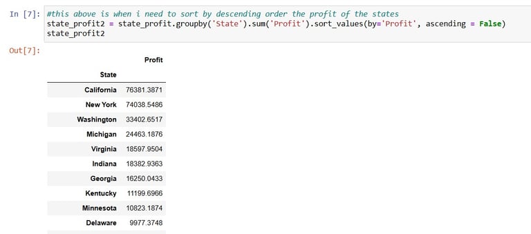
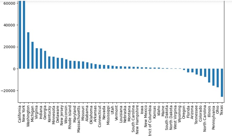
Now on to another visualisation. This time i would like to see the profit for each state, from the most profitable to the least profitable state. Now as the previous groupby was not done in place, the original df still has the original indexing:
From here, I could create another variable and start sorting according to the Profit values, after grouping by State and summing up the Profit:
Now time for Visualisation in pandas:
state_profit2.plot(kind='bar', figsize = (10,6))
A little bit stunning pattern of a bar graph here.
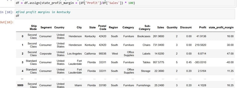
Next I will be re-organizing the original df with a new calculation, adding in the profit margin(for total sales):
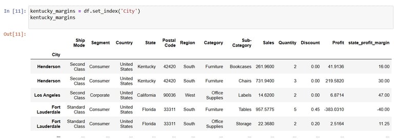
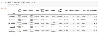
Cool. Now time to set City as index for convenience of the next visualisation:
Now you guessed it from the variable name, I'll be taking Cities from the Kentucky state for visualisation.
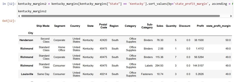
Next, to now sort values according to the profit margin of Kentucky state sales:
kentucky_margins2 = kentucky_margins[kentucky_margins["State"] =='Kentucky'].sort_values(by='state_profit_margin', ascending = False)
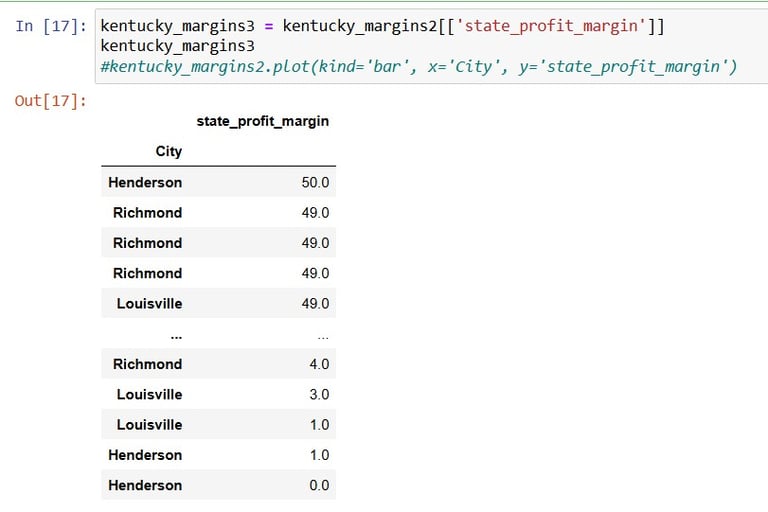
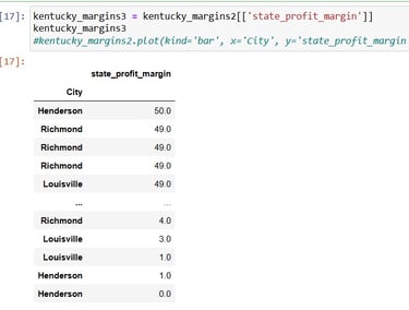
Alright, that looks pretty good too. Now to grab the important thing among the columns, the Profit Margin values:
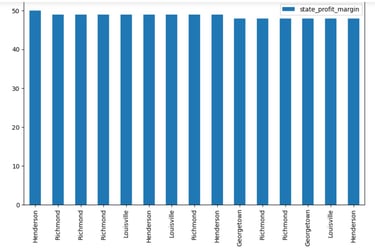
OK, it's Visualisation time:
kentucky_margins3.head(15).plot(kind='bar', figsize=(10,6))
For more details, I might need to dig deeper into the postal codes of the cities, but from here we could see that a few Cities constantly pop up among the top 15 with the highest profit margins.
Huge thanks to this contributor for providing the spreadsheet on Kaggle.