Data Visualisation - A Simple Demo of A Tableau Worksheet
A rather simple demonstration of a Tableau worksheet from a csv import.
DATA
Ian Ng
6/15/20251 min read


Visualisation With Tableau
Tableau's one of the most commonly used data viz dashboards in businesses, that gives a visually stunning view of analysis and insights from data.
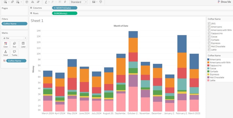
Here I loaded a csv file for a coffee vending machine sales into Tableau Public, and did adjustments to the Date dimension to show month and year values:
In addition to that, the coffee types are marked with colors for easy visual cue on comparison of sales of the different types of coffee in which month of 2024 or 2025. We could also see which coffee sells more than the others on a particular month.
Now, to have the option to only see one type of coffee sales across all periods, I added Coffee Names dimension as filters, so that the stakeholder is able to filter out other types of coffee sales that they do not wish to see.
More on Tableau visualizations in later posts!